Samsung
Samsung makes consumer electronics: phones, tablets and screens. I was hired as a freelance UX/UI Designer through Publicis to design a loyalty program called ‘Samsung Members’ from the ground up, built mobile-first.
Client
Samsung
Type
UI Product Design
Year
2022

Inspiration, not cashback
The brand wanted a loyalty program that worked differently from the usual cashback or discount model. The idea was to give people everyday reasons to use their devices more, by connecting what they'd bought to lifestyle content they could unlock with points: masterclasses, tutorials and recipes across categories like wellness, cooking, cinema and gaming. That meant designing two genuinely different kinds of content, things to buy and things to unlock, inside one point currency and one interface, without either one burying the other.
The brand wanted a loyalty program that worked differently from the usual cashback or discount model. The idea was to give people everyday reasons to use their devices more, by connecting what they'd bought to lifestyle content they could unlock with points: masterclasses, tutorials and recipes across categories like wellness, cooking, cinema and gaming. That meant designing two genuinely different kinds of content, things to buy and things to unlock, inside one point currency and one interface, without either one burying the other.
The brand wanted a loyalty program that worked differently from the usual cashback or discount model. The idea was to give people everyday reasons to use their devices more, by connecting what they'd bought to lifestyle content they could unlock with points: masterclasses, tutorials and recipes across categories like wellness, cooking, cinema and gaming. That meant designing two genuinely different kinds of content, things to buy and things to unlock, inside one point currency and one interface, without either one burying the other.
Inspiration, not cashback
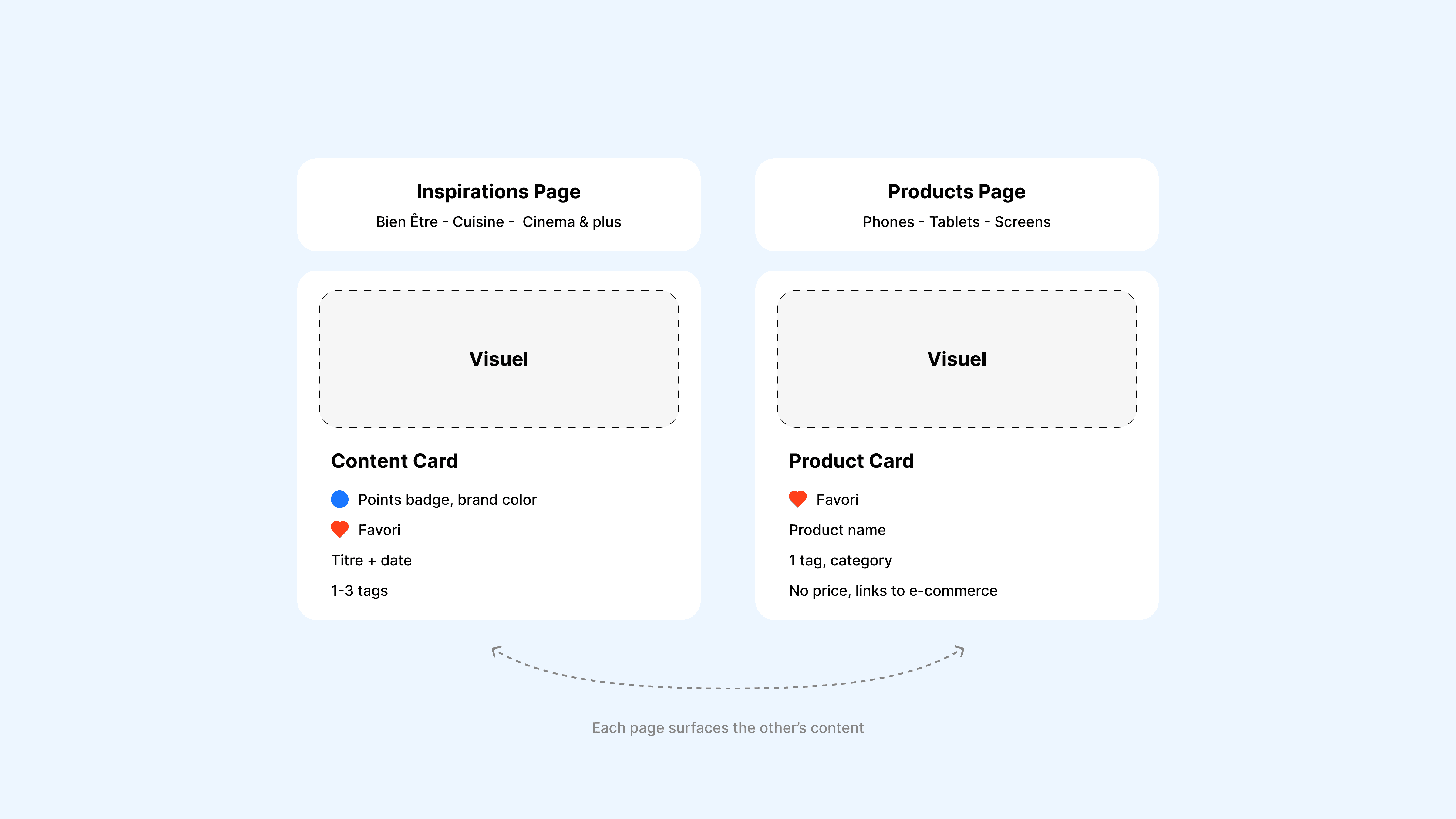
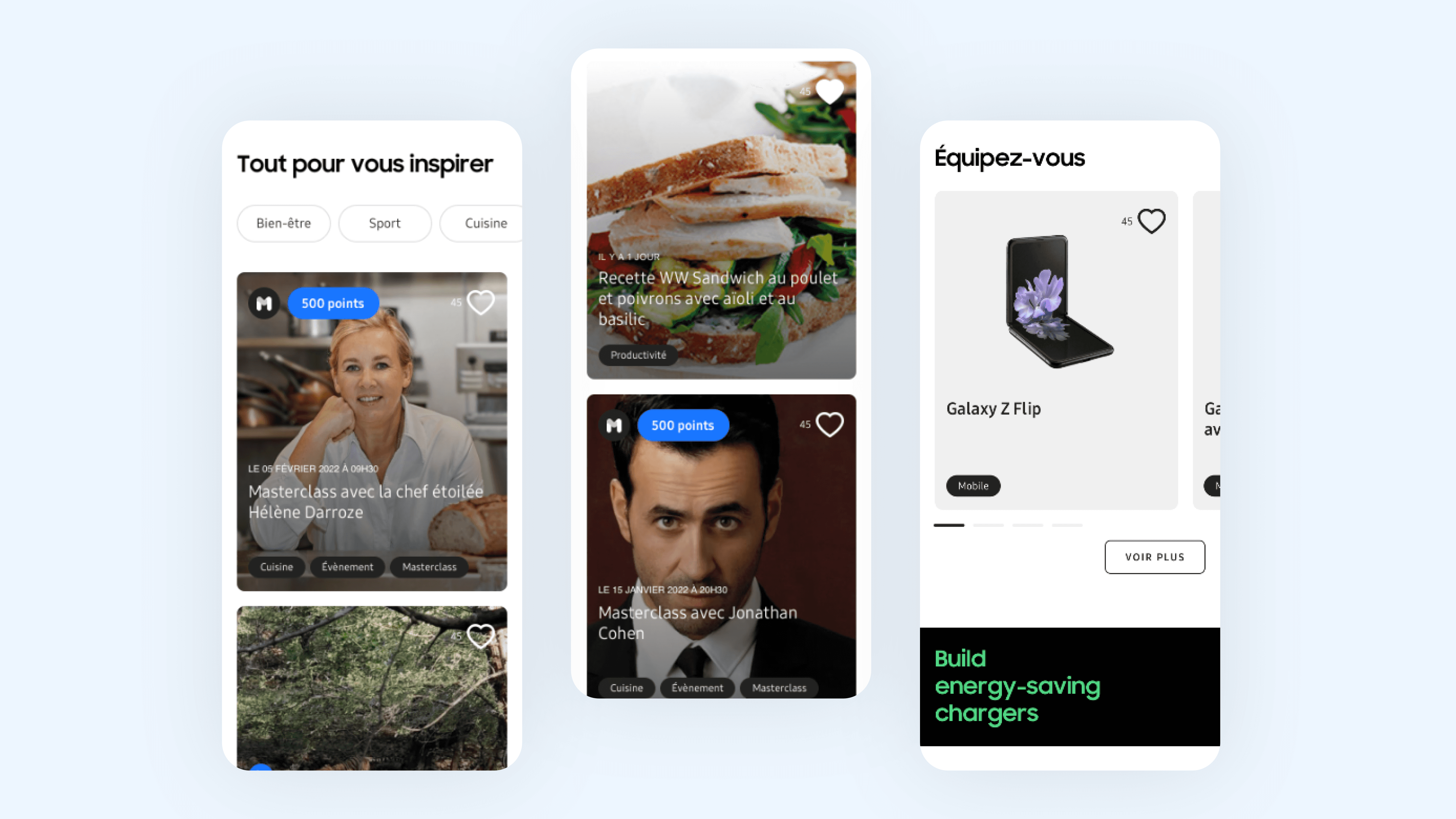
The whole program was built around a simple idea: buying a device should make someone want to do more with it, not just collect points on a card. The two main pages fed each other, content pages surfaced relevant devices, device pages surfaced inspiring content, so buying and being rewarded were never separate modes. Points lived right inside each content card as a badge in the brand's own color, so it read as points rather than a price at a glance. Product cards linked out to the brand's own e-commerce site rather than a purchase flow inside the app, a constraint of the project, so they showed just enough to recognize a device rather than full pricing or details.
The whole program was built around a simple idea: buying a device should make someone want to do more with it, not just collect points on a card. The two main pages fed each other, content pages surfaced relevant devices, device pages surfaced inspiring content, so buying and being rewarded were never separate modes. Points lived right inside each content card as a badge in the brand's own color, so it read as points rather than a price at a glance. Product cards linked out to the brand's own e-commerce site rather than a purchase flow inside the app, a constraint of the project, so they showed just enough to recognize a device rather than full pricing or details.
The whole program was built around a simple idea: buying a device should make someone want to do more with it, not just collect points on a card. The two main pages fed each other, content pages surfaced relevant devices, device pages surfaced inspiring content, so buying and being rewarded were never separate modes. Points lived right inside each content card as a badge in the brand's own color, so it read as points rather than a price at a glance. Product cards linked out to the brand's own e-commerce site rather than a purchase flow inside the app, a constraint of the project, so they showed just enough to recognize a device rather than full pricing or details.

Inspiration, not cashback
The hardest part was filtering. A category like cinema means something different on a tutorial, the actual subject, than on a phone, an editorial link someone else decided. The filter logic was built on instinct rather than tested against an alternative, which is probably exactly why it never fully landed. Looking back, I'd keep content filtering purely by category, and turn device-content connections into contextual suggestions tied to specific content instead of a shared filter.
The hardest part was filtering. A category like cinema means something different on a tutorial, the actual subject, than on a phone, an editorial link someone else decided. The filter logic was built on instinct rather than tested against an alternative, which is probably exactly why it never fully landed. Looking back, I'd keep content filtering purely by category, and turn device-content connections into contextual suggestions tied to specific content instead of a shared filter.
The hardest part was filtering. A category like cinema means something different on a tutorial, the actual subject, than on a phone, an editorial link someone else decided. The filter logic was built on instinct rather than tested against an alternative, which is probably exactly why it never fully landed. Looking back, I'd keep content filtering purely by category, and turn device-content connections into contextual suggestions tied to specific content instead of a shared filter.


Outcome
The program was shelved before launch, for scheduling reasons on the client and agency side, unrelated to the design work. What did get resolved: a single points system tying two genuinely different content types together under one browsing experience, even if the filter logic connecting them never fully landed.

