RED by SFR
RED by Sfr is a telecom provider offering TV, internet and mobile services across France. I joined in 2020 as the sole UI Designer for the website and mobile app, working within a small trio alongside one UX Designer and one front-end developer.
Over the following years that work grew to cover the core product, new service launches and the weekly commercial campaigns that kept the brand visible across the site.
Client
RED by SFR
Type
UI Product Design
Year
2020

Dark Mode
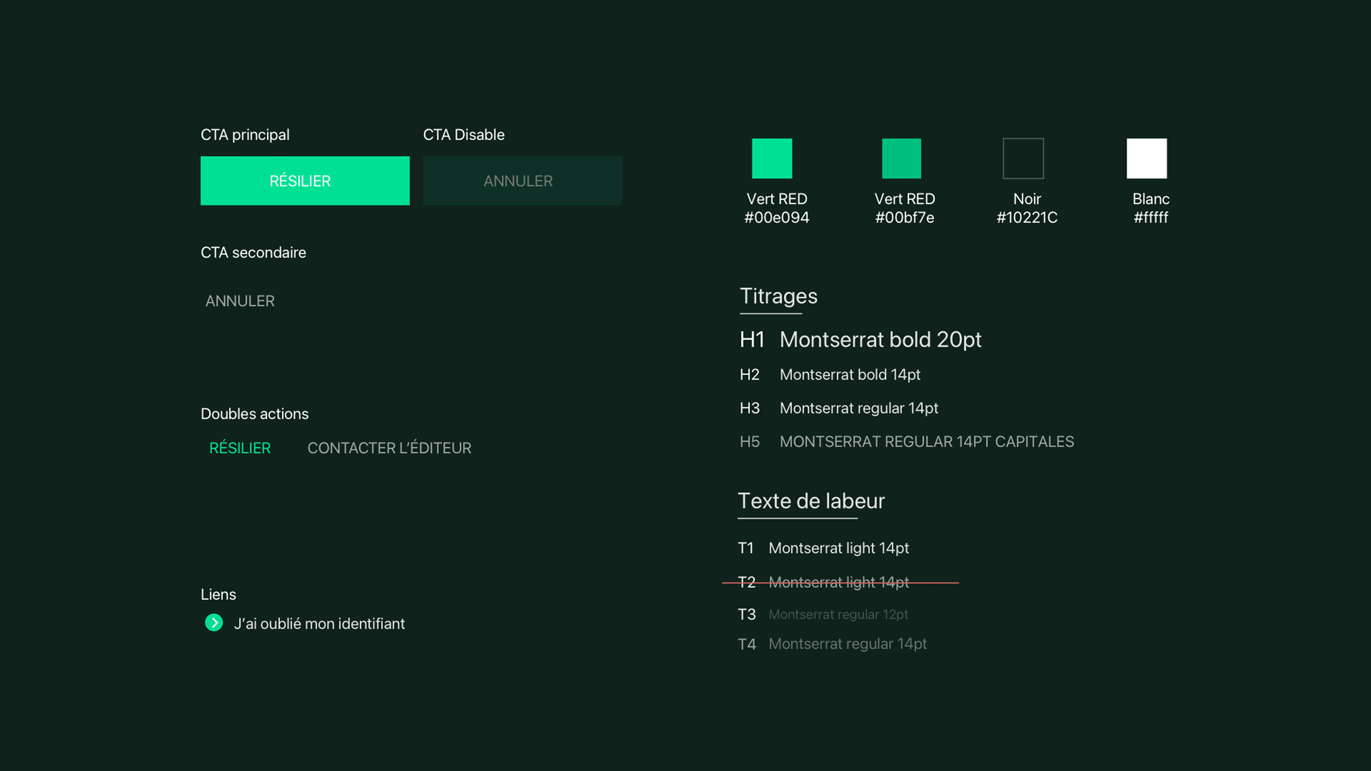
By 2020, dark mode had gone from a nice extra to something people expected, after both iOS and Android added it as a core system feature the year before. But flipping the colors isn’t enough. Brand colors that work on white lose their contrast on black, and the design system used shadows to show depth, which stops working once the surface itself goes dark.
Rather than inventing an approach from scratch, I followed Google’s Material Design guidelines for dark themes, a safer, well-documented reference for a large, risk-averse organization, and one that matched the Android-majority user base the product served at the time: adjusting brand colors for contrast on a dark background, and replacing shadows with layered shades of dark grey instead. I worked closely with the UX Designer on states like hover, pressed and disabled, so they still made sense once the contrast flipped.
Dark mode shipped in 2020, and it’s still live in the product today. That kind of staying power says a lot about how solid the system was from the start.



TV Service Launch
The new TV service needed to feel premium and cinematic before anyone had even tried it, while still explaining a long list of real features: live content, a 30-channel guide, optional themed bundles, replay and on-demand, remote recording management, and voice search. A simple, immersive feeling wants space. A long feature list wants to show everything it can do.
The work covered the app logo and a landing page with a product section built into it (checkout was handled by a separate team). The logo stayed close to the brand's existing mark, just a simple variation. Working from the UX Designer's structure, I shaped how the features actually read on the page, grouping them into a few clear categories instead of a flat list, and catching gaps in how they were organized along the way, so the density stayed legible without breaking the dark, premium feel set up by the visuals.
The service is still part of the company's TV offering today.


Commercial campaigns
Every week, I made promotional visuals for the homepage and ad formats, sometimes up to fifty screens a week. The templates had to do two different jobs: hold a bold, one-off piece like a custom typographic campaign, and also produce something as repetitive as a weekly email fast, without it looking rushed.


More service launches
Other service launches from the same period, each balancing a real feature list against a consistent visual identity, smaller in scope than the TV launch above.


Product UI
Design System & Illustrations
Style guide, custom illustrations, and icon set updates used across the product.


Product UI
Empty states
Illustrated empty states from the shipped product, showing how the visual language carried through to smaller, easy to overlook moments.

Outcome
E-commerce
Phone sales pages and box or plan comparison screens from the site.


